The Daily Difference: Tune Out The Noise
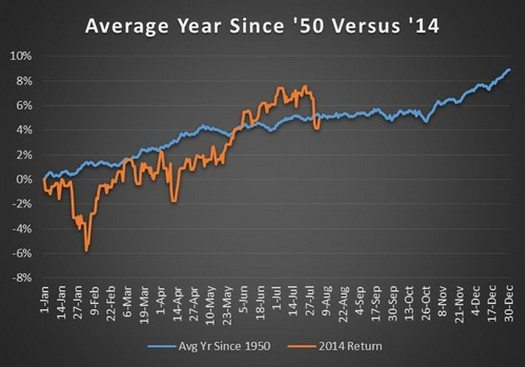
Last week we talked about focusing on the fundamentals and not letting the news headlines cloud investing judgment. For all of us who appreciate a visual representation, we really like this graph. Below in blue, is a depiction of the average annual return of S&P 500 since 1950. The orange shows the 2014 year to date return of the same index. The market remains right on pace for the historical ~9% average return. What a great representation of why not to try and time the markets.
Graph source: RyanDetrick